
In this post, I go over how I worked on UX for a marketplace repricer Software-as-a-Service.
Table of Contents
Part One: Interface
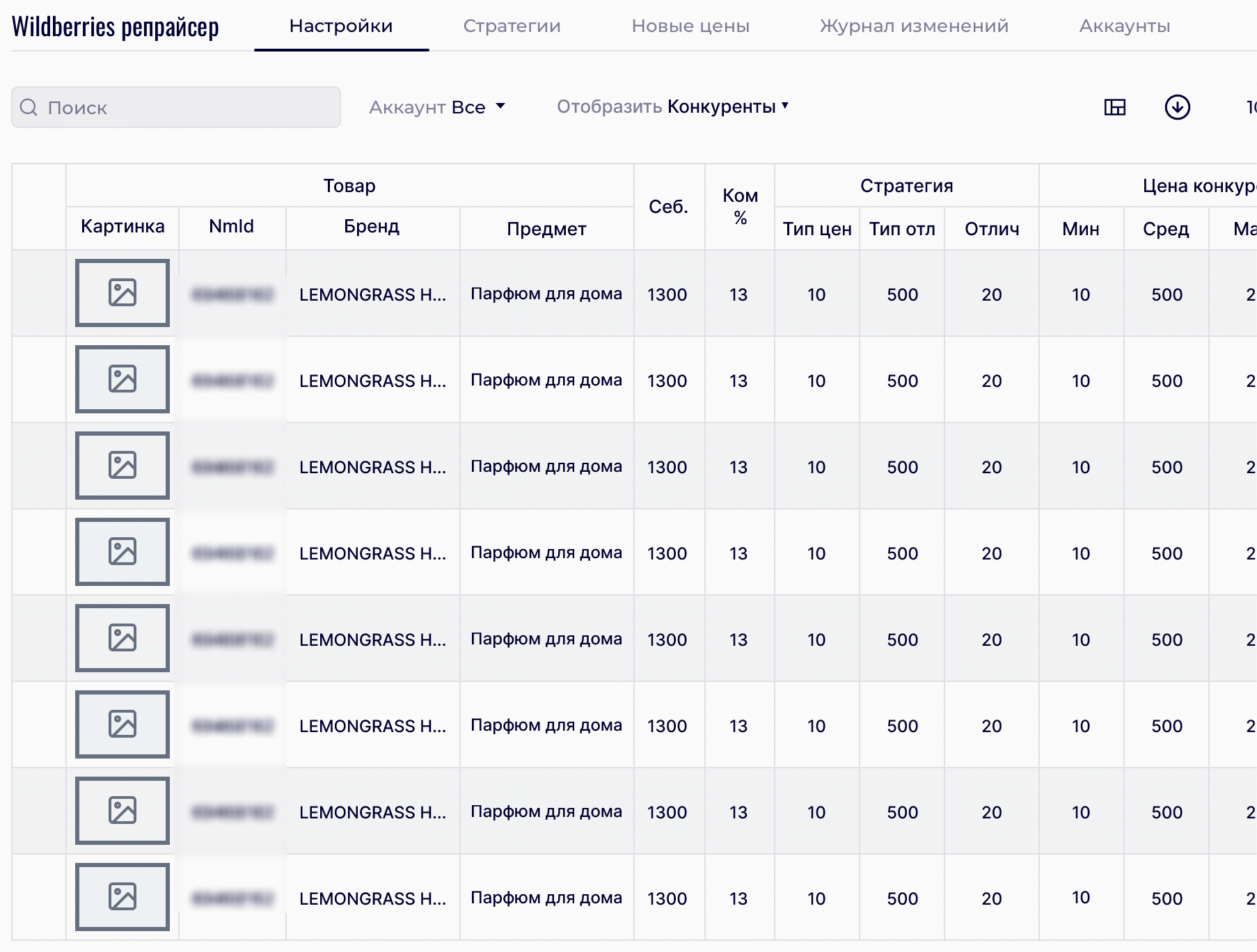
Here is what the interface looked like when I’ve just joined the project:
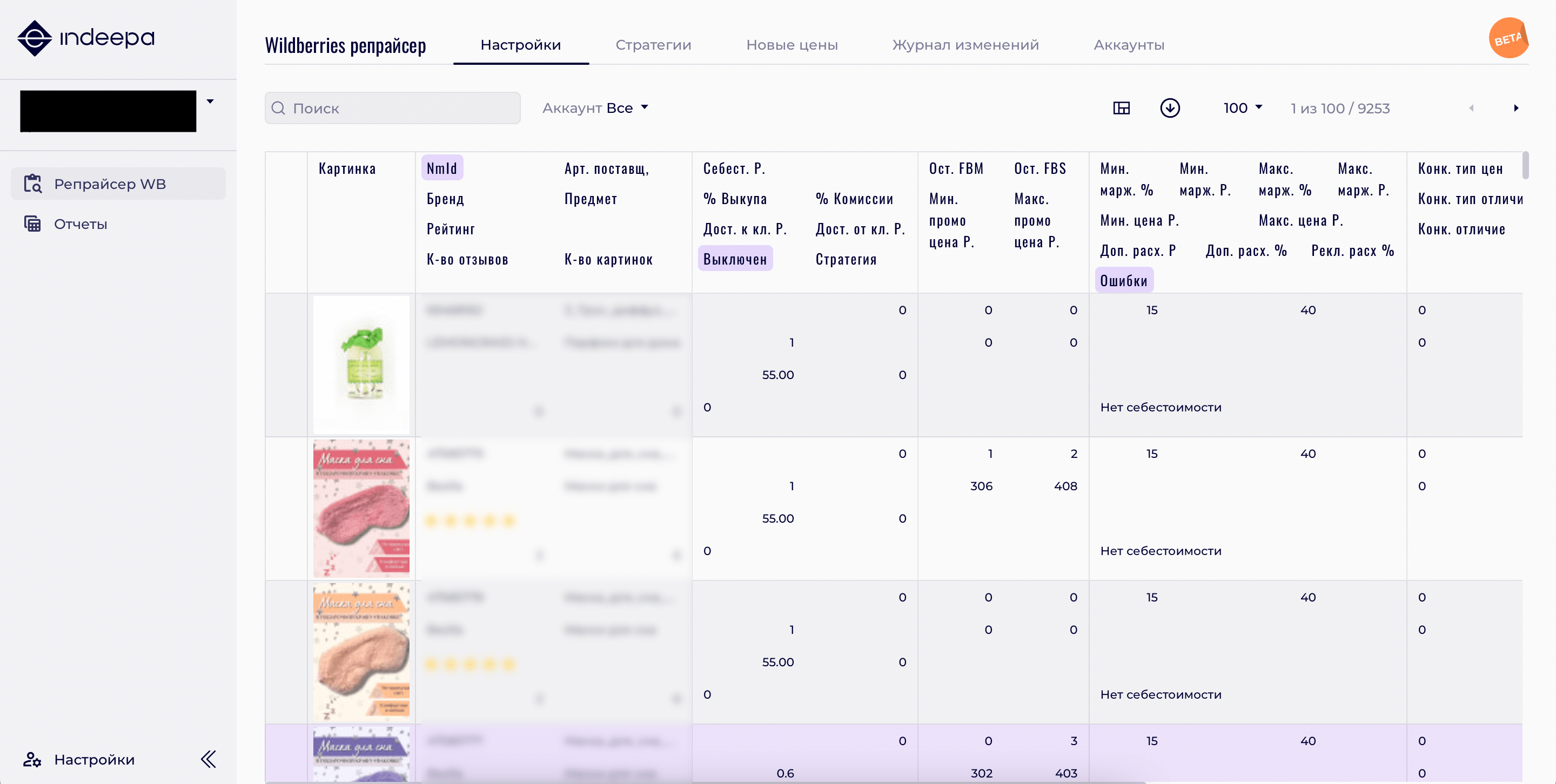
As you can see, this is a UX nightmare.
It’s not just a huge table; it has 42 fields, four levels in each column, a very long horizontal scroll, and other usability problems. For instance, this is how the user is supposed to understand which row a value belongs to.
This hurts my eyes, especially when there is not a one single column displayed, but 10 or 15 at once.
As you read this, keep in mind that I was an outside consultant. I had limited authority and next to no budget. Because of this, some changes were never implemented.
My first idea, naturally, was to really reduce the table:
- Leave 5-10 key fields in sight,
- put everything else under customization options,
- and then put back fields we found out most of the clients were using.
What went against me was the fact that during interviews, we discovered that our clients were expecting large spreadsheets with lots of numbers. This data overload calmed them down and provided them with a sense of control. I decided not to force my way and find a compromise.
Fortunately, I have experience with complex tables. I worked for a vendor known for some of the scariest spreadsheets on the market, and dozens of columns with incredibly long abbreviations.
Step One: Dividing the table
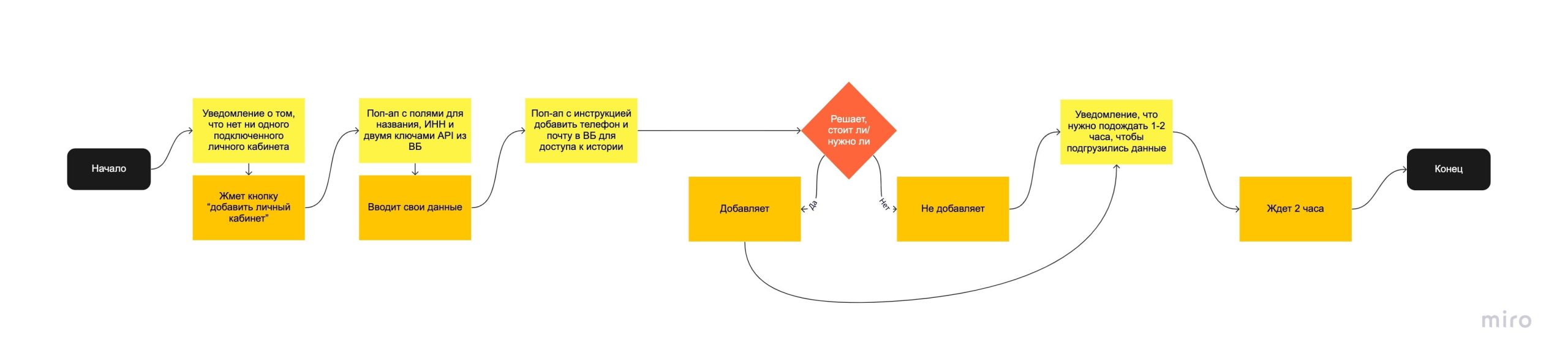
After spending a significant time interviewing users and watching them work, I split their process into the following three steps:
- Setting up prices and profit margin thresholds (setting the cost price and outlining the limits beyond which the software cannot go),
- setting up promotions,
- setting up competitive strategies.
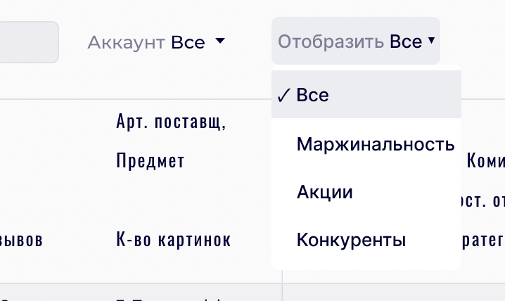
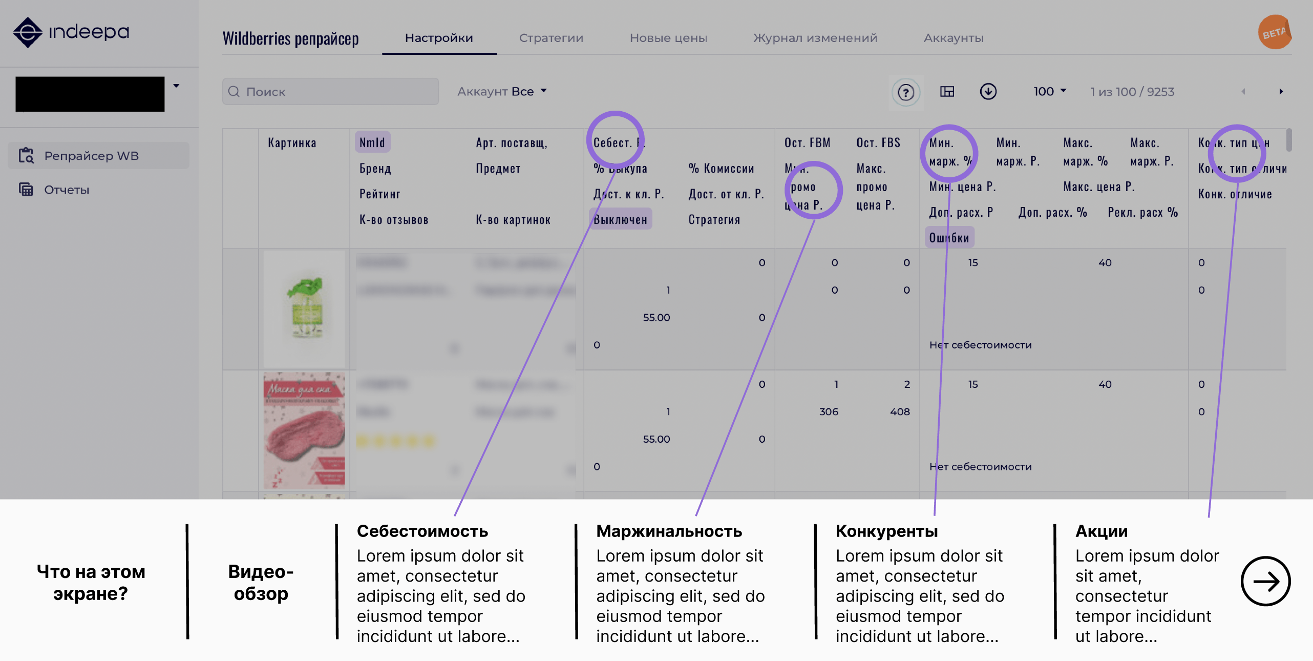
Therefore, we divide the field sets into three groups and make a drop-down selector:
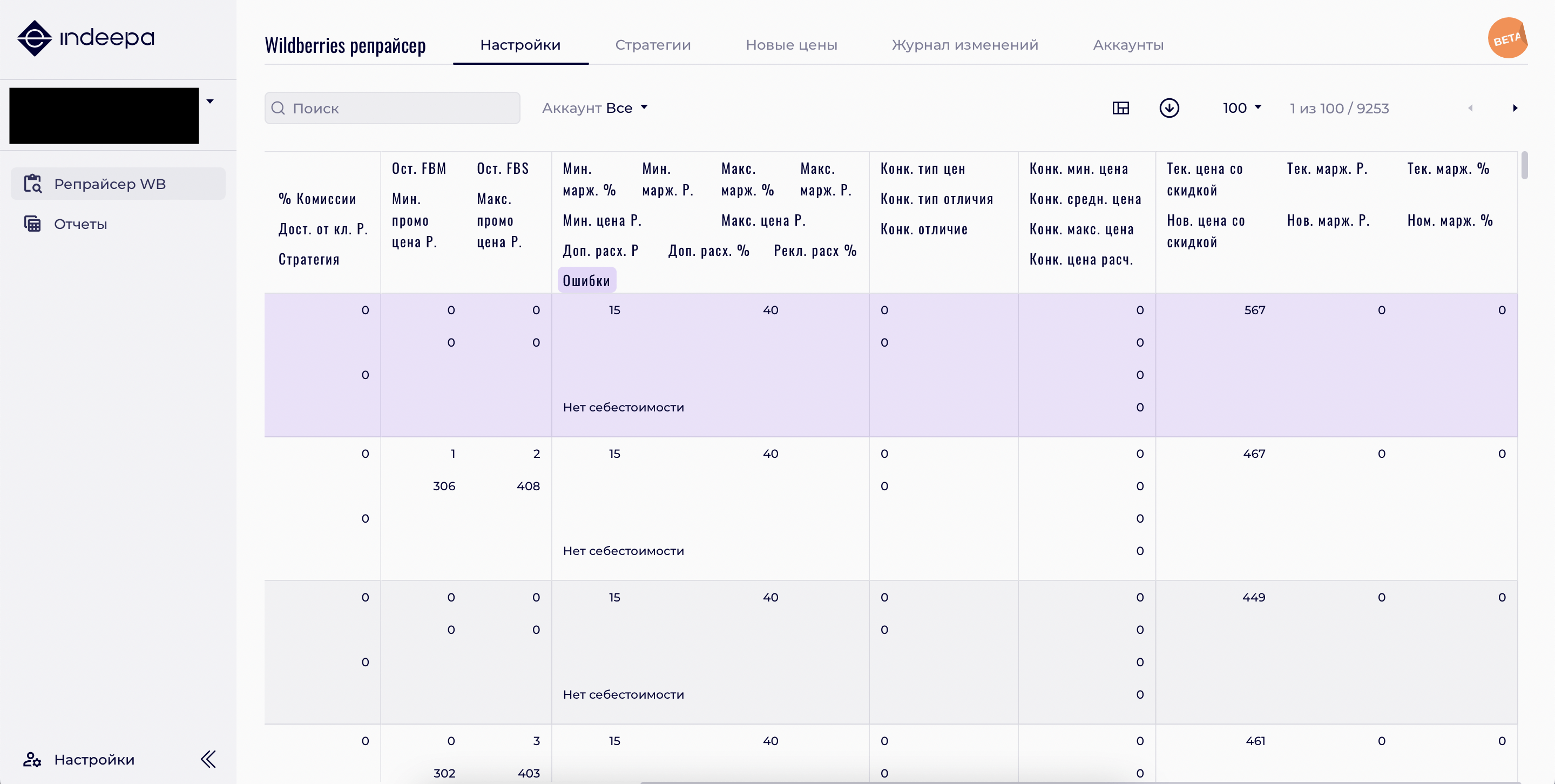
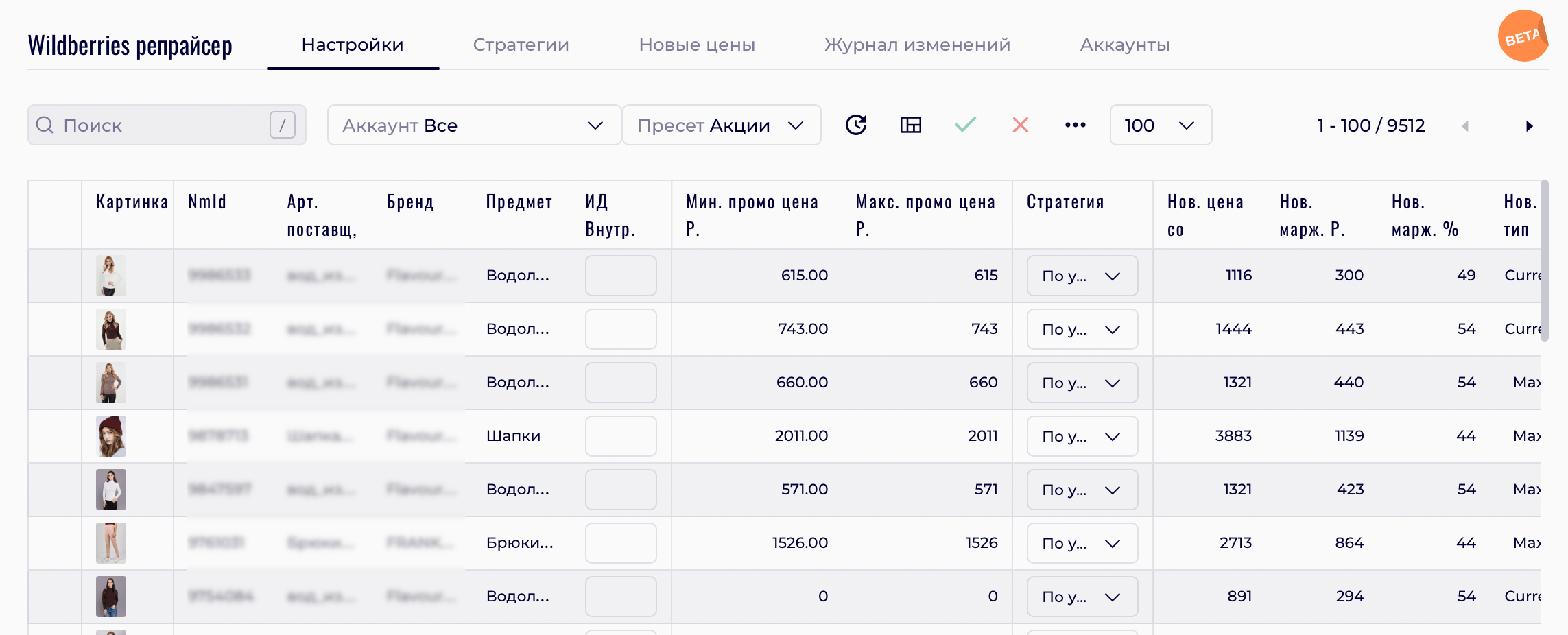
In order to demonstrate the usefulness of such a modification, I’ve made the most complex prototype I ever made:
Here is an example screenshot:
I was able to convince the team that this is what users want.
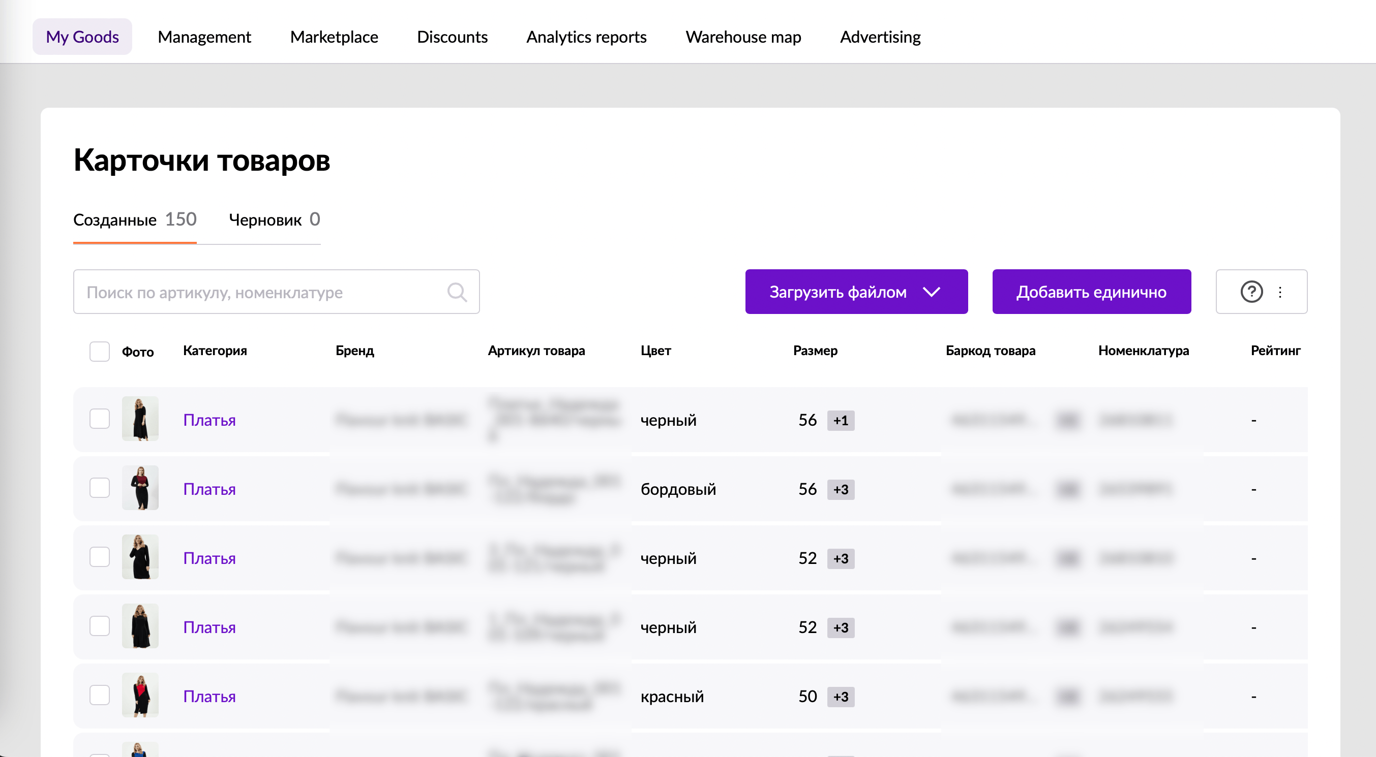
Something that helped me here was seeing how the user dashboard looked like on the marketplace itself. The use case is different, but this is what our clients were used to seeing:
The only thing that I had to compromise on was the first option in the drop-down list. The developers insisted on leaving the old layout as the “main” option.
There were also technical restrictions that added complexity. For example, among other things, developers couldn’t align the width of some columns, couldn’t hide technical fields with nondescript names.
I decided that, given the circumstances, I wanted to do the most with what I had. I documented everything and strongly recommended they follow up on my recommendations, and let them take the tasks into the development backlog. This was sad, but had to prioritize optimization and bug fixes.
Step Two: Reducing the size of the table
We needed to go through the list and remove all fields which we weren’t absolutely certain were needed. I took only the minimum set of fields for each mode, moved the rest into the “additional fields” menu, and suggested adding only what clients directly requested.
This is generally a useful exercise for developers: to ask them to prove that the interface should have more than just a giant green button that says “make me happy”. More or less like this:
- If your software generates a VAT declaration, add a large green button that says “prepare VAT declaration”.
- After some discussion, let’s also add the period for which to prepare the declaration.
- After some discussion, let’s also add declaration types.
- And so on.
I would say that we managed to do half of it. Internal users insisted I add redundant fields. As a result, half of the fields that I removed came back.
However, the reduction of the number of columns even by 25% was already feeling more clean:
Step Three: Checking the UI for problems
I went through all of the interface and noted down things that seemed odd to me. These included illogical transitions and incomprehensible texts, buttons and messages.
For example, I checked visual feedback when inserting data into the table. When you enter data into a field, the action is not visually confirmed in any way. What made this worse was that the data was not saved if you forgot to click on the green check mark in the toolbar after editing the table.
Unfortunately, the only solution that I came up with was adding a pencil icon in the same field. I had to scrap that since the table looked worse for it, and the benefit was not so obvious.
In addition to that, we also did the following:
- Fixed all of the terminology, so that it is consistent on all screens and does not cause confusion. Some examples of this included terms like “account/personal account”, “parameter/variable”, and so on,
- fixed all typos and incomprehensible texts,
- made the tone of speech more user-friendly.
Results of work on the interface
Some of my modifications could not be implemented due to the busy schedule of the developers. Nevertheless, we tried to achieve maximum focus and convenience for the user. I relied mostly on my experience with previous developments and simple Gestalt principles. We will track the metrics and collect actual feedback, after which we will get back to this and edit again.
Part Two. How-to videos
This is the simplest part, I will not dwell too much on this.
I started by trying to visualize the customer journey in Miro, both for myself and the stakeholders.
Then I had to speed up, so I skipped a few steps and improvised:
- I recorded myself as I went through the user scenario,
- ran the video through a transcriber,
- edited the text and had it approved by the stakeholders,
- turned it in for recording and editing.
Did we manage to record the videos? Yes, this was the least problematic step, as I worked on my own.
Part Three. Contextual help
For this part, I prototyped something new: a hybrid mix between a guided tour and contextual help.
Screenshot:
It’s a button in the toolbar that pulsated at a first launch. When the user clicks it, we would display all relevant contextual help to the user in the form of an overlay. Here is what we have on it:
- Text description of the screen with a step-by-step walkthrough,
- screen overview video,
- contextual help on the main fields of the screen.
I’ve done something similar in the past for complex tables and the feedback was very positive.
Did we manage to have this developed? Not yet. The main limitation of a solution like this is that it requires development effort. We found ready-made options, but they all required modifications. As a result, this development likewise received a lower priority and was moved to the backlog.
What else did I do?
I’m not going to pay much attention to these but I also did extra things.
- I taught the development team basics of UX.
- I put together an information architecture using the DITA standard: concept — task — reference.
- Since support would be a big expense for such a complex product, I suggested creating a support ticketing forum. The user creates a ticket, the support person answer, and the result is indexed by search engines and reused.